
PROJECT OVERVIEW
I designed a responsive website for Wild Maidenhead, a local conservation group, with the goal of encouraging users to actively participate in protecting the area’s wildlife, plants, and natural spaces. The project focused on creating an accessible, user-friendly experience that inspires community involvement, makes it easy to find volunteering opportunities, and highlights the importance of preserving Maidenhead’s natural environment.
Role
UX/UI Design
Responsibilities
Date
User Research, Wireframing and Prototyping
March - August 2025
The Problem
The current website is dated and does not draw significant traffic. Wild Maidenhead has a Facebook community of 2.7k but only 192 paid members. Activities are held each month but very few members regularly participate.
The Goal
-
To give members of Wild Maidenhead a simple, engaging website that makes it easy to find information about wildlife projects in Maidenhead and sign up for activities and events.
-
Increase active involvement and membership.
-
Attract additional, younger experts.
UNDERSTANDING THE USER
User Research Summary
-
Although most active WM Facebook members are 50+, 34% of the Facebook group are 29-44 and 17% are 16-28.
-
Females account for 53% of the Facebook group but are responsible for a disproportionate 61% of the groups content contributions.
-
I surveyed the WM Facebook group to understand users’ motivations and interests. Improving biodiversity is the main area of interest at 60%, followed by influencing local policy 20% and spending time outdoors 20%.
-
To gauge awareness of the Wild Maidenhead website, I created a Facebook poll. 51% of contributors were unaware of the website, 38% used it less than once a week and only 11% used it at least a once week.
-
To understand the pain points of using the website, I ran a moderated research study of six participants. Target participants’ characteristics were that they were interested in nature and aged 16-60.
To read the full UX user research study Click here.
Research questions and empathy maps
-
Can you find what you are looking for on the website?
-
Is there anything else you would like to see on the website?
-
Would you like to join future events?
-
Do you know how to book a place at the events?
-
Would you like to attend events with family or friends?
-
Is there anything else you would like to add?
By creating empathy maps for each of the participants, I was able to clarify user needs and emotions and spot any gaps in the research.
.jpg)
I then used a consolidated empathy map to identify themes and pain points.
.jpg)
Pain Points
Using empathy maps, I identified the most common user pain points.
01
Outdated content
Lack of information on current and future projects and how to take part. Frustration over past events being featured.
02
Confusing booking process for events
Lots of interest in events but a lack of information on the booking process creates confusion.
03
Inconsistent event information
Details on the events page, the attached PDF and the Meetup page are different, leading to frustration.
04
Confusion about membership
Users do not understand if they have to become a member to attend events.
05
Event concerns
A lack of information on events deters users from booking.
Personas
I developed three personas based on user interviews. This case study focuses on Carol whose needs most directly shaped the design.

Carol
Carol loves spending time with her grandchildren and working in the garden. She wants to improve her social life and participate in something that keeps her moving. She has some health conditions that affect what she can do and this often puts her off joining clubs or groups. She doesn’t want to be committed to a regular club but wants to be able to join in when she feels like it. Carol would like to learn more about wild plants and animals in Maidenhead and improve biodiversity.
Age:
Education:
Location:
Family:
Occupation:
72
O Levels
Maidenhead
Married with adult children
Retired teacher
“If the seats aren't comfortable I won't be staying long."
Goals
• Spend quality time with my family.
• To keep moving and get fitter.
• Meeting new friends.
• Have some fun.
• Learn something interesting.
• Improve biodiversity where I live.
Frustrations
• Not finding the required information.
• Not being able to find out more about the events before signing up.
• Concerns about injuries effecting her ability to take part.
Carol's user story
As a retired lady, I want to participate and help local biodiversity, so that I can improve my social life and get moving to stay healthy.
Mapping out the flow of Carol’s journey revealed that it is difficult to locate up-to-date biodiversity projects on the website, and a lack of event information causes worry and confusion.
Problem Statement
Carol is a retired grandmother who needs to find informative events, because she wants to stay active and improve her social life.

Goal Statement
Design an accessible digital experience for Wild Maidenhead that empowers residents of all ages and backgrounds to easily discover and engage with local nature, conservation, and community events. The site should support social connection and active participation in protecting and enhancing the local environment.
Competitive Audit
I then completed a competitive audit of direct and indirect competitors to identify their strengths and weaknesses.
Key Competitors
The audit included the following competitors:
-
CPRE (Direct)
-
The Wildlife Trust (Direct)
-
RSPB (Indirect)
-
The Woodland Trust (Indirect)
Recommendations for Wild Maidenhead
To read the full report Click here
-
Enhance Mobile UX: Prioritise responsiveness and intuitive layout on mobile.
-
Leverage Interactive Features: Consider campaigns like 'Nature's Calendar' for engagement.
-
Strengthen Brand Identity: Clear visual identity and mission should be reinforced across platforms.
-
Improve Navigation: Structured menus and high-contrast CTAs enhance usability.
-
Create Inspirational Content: Develop resources akin to Wildlife Watch to drive action.
STARTING THE DESIGN
User flows
With the information I had gathered, I was able to define four common user tasks.
-
Find the location of interesting wildlife.
-
Find information on local biodiversity.
-
Participate in sociable informative or outdoor events.
-
Find information on local wildlife campaigns and how to get involved.
After sharing the proposed user tasks with the Wild Maidenhead team, they confirmed that they want to avoid campaign and policy matters. I've therefore concentrated on the remaining three tasks.

User task - Participate in sociable informative or outdoor events.
Site Map
I built user-focused flows to ensure that my personas could complete their key objectives while reducing any existing pain points.
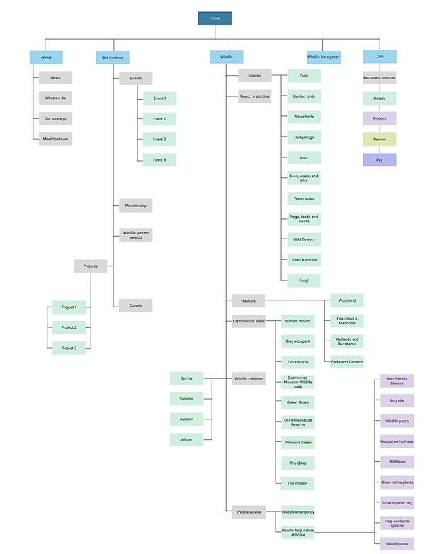.jpg)
Screen size
Survey results show that slightly more Wild Maidenhead Facebook group members refer to the current WM website on larger screen types, desktop and laptop. I will therefore apply graceful degradation to my designs.
Paper Wire frames
Home page ideas


Following an initial exploration of layout concepts, I selected a full-width hero section to create immediate visual impact. Below this, a centred content container employs a layered, tiered structure to clearly distinguish the page’s three key content zones, guiding the user through a logical and engaging flow.
Digital Wireframes
The main toolbar provides three user flows: About, Get involved and Wildlife, which capture all the site content.
The mid-section will be regularly updated with quarterly newsletters and updates on the ‘Friends of’ projects.
_edited.jpg)
Footer for information and advice
Wildlife Emergency and join take the most prominent position on the top menu bar.
The top section highlights the three areas Wild Maidenhead would like to promote: Events, Membership and Ways to help at home.
The bottom section holds information and allows users to find out more about local species and habitats.
Dropdowns
Users can access the Wildlife Calendar and advice resources via a multi-level drop-down menu within the Wildlife section


Low-fi prototype

Usability Study findings
Round 1: I interviewed five users as part of a moderated usability study – w/c 5th May, 2025.
The website was very well received with few iterations required.
01
Two users wondered what the blank area on the first level of the Wildlife drop-down menu was for.
02
Three users thought the ‘membership’ and ‘book’ buttons at the bottom of the ‘Holly clearing’ event page were confusing.
03
Two users commented that the Facebook icon usually goes before the Instagram logo.
REFINING THE DESIGN
Mock-ups
Taking this user feedback into consideration I continued to develop the wire frames into hi-fi mock-ups.
01
Remove the blank space on the drop down and make it wider only when the information is needed at the next level.


02
Improve the membership and book buttons at the botton of the events page by adding clear instuctions.

.jpg)
03
A simple swop if the Facebook and Instagram icons to fit with convention.
_edited.jpg)
_edited.png)


.jpg)
.jpg)
.jpg)
.jpg)
Check-out process
The membership checkout offers a four-step process with progress indicators to provide clear orientation.
Ideation
After a meeting with the Wild Maidenhead team to present the Hi-fi prototype, I received the following feedback:
-
They like the overall look and simplicity of the site.
-
The Information architecture and information flows are intuitive and work well.
-
The events page works well for projects, but they would like to treat ongoing and one-off events separately.
-
The wording sometimes puts a focus on wild spaces, but many of the spaces WM works with are not wild. ‘It’s about helping nature wherever we can, and that’s often in town parks that will never be wild.’

Next Steps
01.
Review the 'Projects' page to incorporate feedback.
02.
Adjust copy to reflect the wild emphasis being on nature and not the spaces themselves.
03.
Differentiate the articles in the ‘The Latest News’ section of the home page so they stand out as separate articles.
04.
Improve on the design of the ‘Wildlife Calendar’ page so it reflects the season more.
Design updates based on stakeholder feedback
01
As requested by the WM team, ongoing projects and one-off events now have separate user flows. Both routes fulfil the same user needs to ‘get involved’, so they have a clear link between the pages

.jpg)
_edited.jpg)

.jpg)

02
Copy has been adjusted to reflect the wild emphasis being on nature and not the spaces themselves.
03
Alternating the orientation of the articles in ‘The Latest News’ section felt unnecessary, so I have simplified the layout. Adding a different colour to each tile of the same section differentiates each article and helps it stand out in its own right.
_edited.png)
_edited.png)
04
I wanted to visually reference the season on this page and since there are so many images already, a subtle background image fulfils this brief and improves the standout of the tiles.
Tiles of the same width reduce visual complexity and allow for a larger reference image.
.jpg)

Hi-fi prototype

Usability Study findings
Round 2: I interviewed five users as part of a moderated usability study w/c 18th and 25th, July 2025.
They then completed a System Usability Scale (SUS), which scored 87.5, indicating excellent usability. This places it well above the industry benchmark of 68, suggesting that users found the site intuitive, efficient, and satisfying to use.

Accessibility Considerations
01
Clear Text Contrast and Readable Typography
Present text on solid colour and not imagery to improve contrast and clarity. Use a minimum contrast ratio of 4.5:1 for body text and 3:1 for large text. Avoid light grey on white or thin fonts over busy backgrounds.
02
Keyboard Navigation and Focus Indicators
Ensure all interactive elements (menus, buttons, forms) are accessible via keyboard, with visible focus states to show where the user is on the page.
03
Descriptive Alt Text for Images and Media
Write meaningful alt text that describes the image’s purpose or content—especially for wildlife photos, maps, or event posters.
Approved designs
Wildlife flow for information on biodiversity


Get Involved flow for event and project information


Membership and checkout flow


Sticker sheet
_edited.png)
GOING FORWARD
The Impact
I led the UX design and build of Wild Maidenhead’s new website, creating a simple, engaging platform that makes it easy for users to discover local wildlife projects and sign up for events. Although not yet live, the site has already achieved a System Usability Scale (SUS) score of 87.5, indicating excellent usability. Early feedback from members indicates increased engagement, with more users planning to actively participate in projects and events, and a noticeable rise in interest from members of the Facebook community who were previously unaware of the website. The design successfully translates Wild Maidenhead’s mission into a clear, accessible digital experience that acts as a central hub for their online community.
What I Learned
Designing Wild Maidenhead’s new website was my first real-world UX project, and it taught me how to translate user needs into a clear, engaging digital experience. I learned how to balance stakeholder goals with usability best practices, simplify complex content, and guide users toward meaningful action, whether that’s exploring local wildlife projects or signing up for events. Collaborating with a community-focused team helped me refine my communication skills and stay grounded in purpose-driven design. Achieving strong user feedback and a positive SUS score confirmed that the site is not only functional but genuinely intuitive and satisfying to use. Most importantly, I saw how thoughtful UX can increase engagement, attract new audiences, and make a real impact.

Next Steps
01.
Invite any last-minute feedback or clarifications, especially around content, accessibility, or mobile responsiveness.
02.
Document any agreed changes and update my design files accordingly.
03.
Quote for development of the remaining website pages not covered in this project and website build in Wix.