

PROJECT OVERVIEW
This project focused on designing a responsive e-commerce website for a camping supply company that both showcases and sells outdoor products. The goal was to create an engaging and intuitive digital experience where users can discover gear, explore expert advice, and find personalised recommendations suited to their camping needs. Recognising that camping attracts a diverse audience, from casual campers to seasoned adventurers, the website uses six distinct camping experiences to help them plan and prepare for their ideal trip.
Role
UX/UI Design
Responsibilities
Date
User Research, Wireframing and Prototyping
August-October 2024
The Problem
As users can not physically see and touch the products they are shopping for they lack confidence and sometimes inspiration to create a camping trip that fits their needs.
The Goal
-
Increase user satisfaction by understanding common challenges people face when trying to find the items they need for a camping trip.
-
Increase conversion rates by identifying frustrations people experience during the process of ordering camping supplies online.
UNDERSTANDING THE USER

Since this work followed the app design for Camping Collective I drew on my knowledge of the same user pain points from that project and the user research I already completed. To see my research
STARTING THE DESIGN
Site Map
I built user-focused flows to ensure that my personas could successfully complete their key objectives while reducing any existing pain points.
.jpg)
Paper Wireframes
Desktop home screen ideas


Chosen design
A tiered layer cake layout, organised by
audience scheme for the user experience flow and topic scheme for the product user journey.


Alternative screen sizes

Experience page
Chosen design


Product page
Chosen design


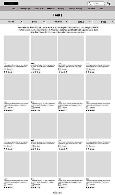
Digital Wireframes
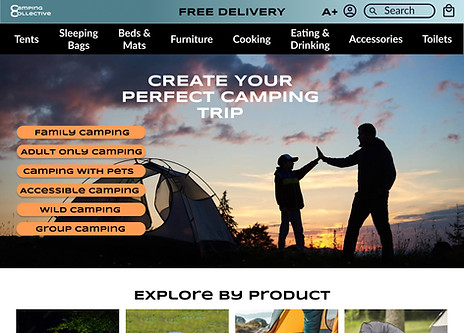
Home page
Information hierarchy on this page:
-
Shop by experience
-
Shop by product
-
Seasonal content
The top section takes the user to a different page depending on the camping experience they want to create.
Mid section for shopping categories.
Bottom section can change to feature different/seasonal content.
Footer for information and advice.


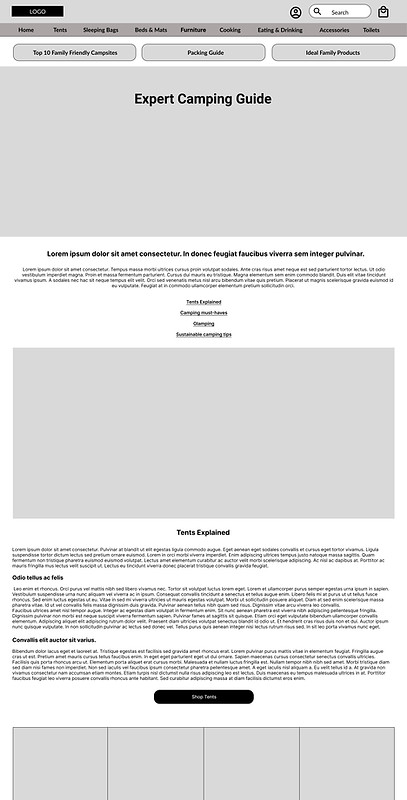
Experience page
I have added action buttons to each section to clarify the call to action.
Buttons lead to other experience categories in case the user is interested in more than one.
The top navigation bar changes to a burger menu in the mobile version.
Z Shape asymmetrical layout with four articles that could be easily added to at a later date.


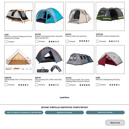
Product page:
I used square cards for a cleaner look and to allow more space for a compare box and star rating.
Intuitive filters to find products quickly.
Compare box allows you to create a shortlist.

Low-Fidelity Prototype

Inspiration User Flow
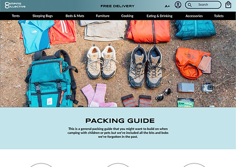
Home Page > Family Camping > Camping Guide > Top 10 family Friendly Campsites > Packing Guide > Products Ideal for Family Camping.
The user would then follow the purchase and check out user flows.
To view prototype, click here
Usability Study Findings
Round 1: I interviewed five users as part of a moderated usability study - 8th September 2024.
The app was well-received but the Camping Guide needs iteration.
01
All users found the camping guide difficult to understand and some felt overwhelmed by the amount of text.
02
Two users thought the links at the top of the camping guide didn’t catch their attention and could be made more exciting.
03
Users would like to be able to return to the inspiration pages from the bottom of the Family Friendly Products page
REFINING THE DESIGN
01
Illustrating the pros and cons for each type of tent and accomanying with a visual creates a easily digestible, quick reference guide.
02
Icons for each section of inspiration create clear visual ques.
Before usability study
After usability study
.jpg)
03
Buttons at the bottom of the page allow users to move to the other inspiration pages or back to the top of the page.

.jpg)
Hi Fi Mock-ups
Original Screen Size


.jpg)
.jpg)

A+ Screen Size

High-Fi Prototype

To view the prototype, click here
Screen Size Variations


To view the prototype, click here
Accessibility Considerations
01
A+ version
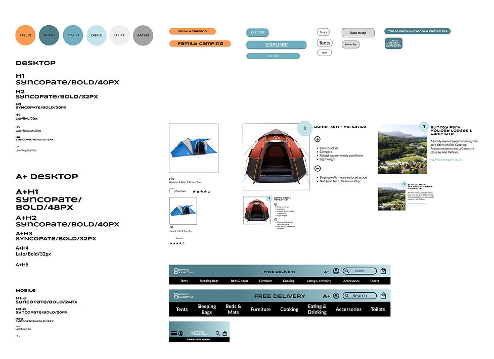
I have included two examples of how text can be increased to create a easy to read desk top version without impacting the design. A+ should be available for each format.
02
Text Hierarchy
I implemented a text hierarchy throughout the app. This makes using a screen reader possible and helps users to distinguish the different sections and information on screen.
03
CVD-Friendly Colour Palette
Blue and orange can clearly be distinguished by users with Colour Vision Deficiency (4.5% of adults on the UK).
Additional differentiation has been achieved by reducing the saturation of the pale blue.
Sticker Sheet
.jpg)
GOING FORWARD
The Impact
Our target users shared that the design was intuitive to navigate through, more engaging with the images, and demonstrated a clear visual hierarchy.
What I Learned
I learned that even a small design change can have a huge impact on the user experience and that it is vital to have a design that is easy to adapt and update. The most important takeaways for me is to always consider accessibility.

Next Steps
01.
Request UX/UI feedback from designers with more experience in the field to improve design.
02.
When I have documented all feedback that was provided, I will make the necessary design updates to improve the app’s overall experience.
03.
Design screen size variation for a tablet. The goal is to build the same experience for all users, no matter what type of device they are using.